Sunday, March 18, 2018

After Effects Video


Here's the link to the tutorial!


What were you trying to accomplish?

I was trying to create the effect of an energy ball in after effects. I wanted to make it as visually interesting as possible. I followed a tutorial on Youtube to create this effect.

What technical skills did you use?

I made use of several different solid layers in this project. I also used many different effects on the ball such as fractal noise, VC vibrance, and offset turbulence. I used offset turbulence to create the unstable effect on the ball. In addition to this I used VC vibrance (an after effects plugin from Video Co-pilot) to give the ball its red/purple coloration.

How do you feel you did on the project

I feel I did pretty well on this project. I really enjoyed working through it, and I think the finished product looks pretty satisfying. I think the unstable effect is the most appealing aspect about it.
Website Template


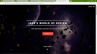
What were you trying to accomplish?

I was trying to use a pre-made website template to create my own site. I added wanted to add my own information and images as well as remove some unnecessary divs.

What technical skills did you use?

For this assignment I edited the code of the template directly. I deleted some divs within the code by clicking the specific div tag and simply deleting the entire thing. To replace the images in the template, I placed my own images over the originals in photoshop and re-saved them.

How do you feel you did?

I think I did well on the assignment. I was able to use my prior knowledge of coding to make the whole thing easier. I like how the header image turned out as well.

Thursday, March 15, 2018

Kiosk Animation


What were you trying to accomplish?

I was trying to make an animation in after effects that utilized the use of various expressions. I was also trying to make the text catch your eye with the way they appear on the screen.

What technical skills did you use?

I first began working in illustrator to create the model for the cactus. When I moved into after effects I applied puppet pins to the cactus to allow it to "dance". I also used pins so that the cactus could wave. To give the text a little wiggle, I used the "Inertial Bounce" expression. Within the expression, I tweaked the amplitude, frequency and decay to find the optimal amount of bounce.

How do you feel you did?

I think I did pretty well on this animation. I find the cactus I animated quite amusing. I also like how I got the original price of the cactus to get bumped away by the discount.

Monday, March 12, 2018

Alternate Art Re-Creation


Font Set


What were you trying to accomplish?

I was trying to create a font set of capital letters. I wanted to make sure that they all looked to be relatively the same style as each other. I wanted to create a hand drawn look.

What technical skills did you use?

I first created each individual letter for the font set in illustrator. I set guides for my baseline and ascender so I could draw the letter accurately. I used the brush tool to draw the letters. I then copied and pasted them into the font creator software and adjusted the height and kerning consistently.

How do you feel you did?

I think I did well for creating a font set for the first time. I feel as though I should have played around with more brushed before deciding on the one I did use. With that said I am still happy with the rough pencil-drawn look of my font set.

Vintage Art Re-Creation


What were you trying to accomplish?

I was attempting to recreate a piece of vintage art that I found on the web. I wanted to keep it as close as possible to the original artwork for consistency's sake. I also tried using close to the same colors as the original.

What technical skills did you use?

I started with use of the pen tool to trace the outline of the moon and then the inside of the moon. I then selected both shapes and used minus front with the pathfinder tool. For the woman I mostly used the pen tool to trace the hair, loose hair strands, and facial features. I trapped the face shape layer underneath the hair layer.

How do you feel you did?

Although my design is fairly simple, I still feel that I did well in staying as close as possible to the original using solid shapes. Although the original has slight use of gradients, I still believe my iteration is effective.

Sunday, March 4, 2018

Google Slides Infographic


What were you trying to accomplish?

I was trying to create a simple yet engaging infographic. I stuck with my original topic from the 210 class. With that topic I created new graphics as I was not allowed to use the one from the previous quarter.

What technical skills did you use?

I used a lot of the shape building tool to make the diagram. I first created the body with various ellipse shapes and squares. To create the smoke and veins on the heart, I simply created a stroke and tweaked the weight and profile of it. When I started in Google Slides, I placed invisible buttons onto the various parts of the diagram as to make them interactive.

How do you feel you did?

I feel I did well for having to create new graphics for my idea. I like that I made both lungs clickable and not just one. Although I am happy with the design, I feel that the mouth may not be as obvious that it is clickable.

Monday, February 26, 2018

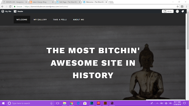
Content Management System


Link to website here


What were you trying to accomplish?

I was trying to create a Wordpress site with multiple pages and different types of content. I chose to use a parallax style layout, with each page having a different header image.

What technical skills did you use?

I first browsed through a few free themes to decide on the one that I thought would work. From there I customized the entire theme itself. I changed the header image for all four pages and gave each page different content. I inserted a gallery and a poll on their respective pages. I also created and edited a menu to organize my pages in a condescending order.

How do you feel you did?

I think I did fairly well on my Wordpress site. I like how everything turned out with the parallax style, although I ran into a small issue I have not been able to resolve. I was unable to update the header image on my posts page.

Sunday, February 25, 2018

3D Asteroid Field


What were you trying to accomplish?

I was trying to emulate the look of an asteroid field using the Lightwave 3D software. I also attempted to give them enough variety to make the scene more believable.

What technical skills did you use?

To create the asteroid model, I started with a cube shape. I subdivided the cube to give it more polygons to work with. I selected specific polygons on the shape and extended them to eventually create a rocky texture. To create an entire field of asteroids I used the spray tool in the Lightwave modeler, and then squished them down so the field would appear flatter.

How do you feel you did?

I feel I did well on this assignment. I feel I created a fairly believable asteroid model in Lightwave, and I really think the lighting on the asteroids matches well enough with the backdrop I chose. The silhouette of the asteroids is a nice touch as well.

Digital Painting


What were you trying to accomplish?

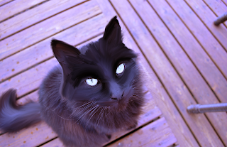
I was trying to create a painterly effect on a pre-existing image. I wanted to make the photo appear similar to that of an oil painting. I was also trying to create brush strokes that looked as smooth as possible to achieve the look of a painting.

What technical skills did you use?

For this project I used the mixer brush tool in photoshop. At first I used the reservoir feature of the mixer brush, but I decided to set the brush to use only the colors from the area I was making a brush stroke. More specifically, I made use of the various bristle brushes in photoshop. I used mostly the fan brushes, and occasionally used point brushes for the small details on the eyes of the cat.

How do you feel you did?

I think I did very well for my first attempt at a project such as this. I really like how the strokes on the fur of the cat turned out, as they appear very smooth. I found the boards of the deck to be a bit difficult seeing as how they were out of focus to begin with.

Sunday, February 11, 2018

Card Game Designs


What were you trying to accomplish?

I was trying to create a specific style throughout my card designs. I went for a cartoon-ish appearance with the characters featured on the cards. I also kept the colors bright and simple.

What technical skills did you use?

I ended up using the shape builder tool quite a lot for the sword, hammer, hard hat, and helmet. I also used the pen tool to create the small bits of shading on the various objects. I also created outlines for all type used (as was required).

How did you feel you did on the project?

I think I did well on this assignment. I really like how my simple cartoon idea for the aesthetic turned out. I also like how they all match the cartoon theme very well, even the brick wall design.

3-D Pop-up Photo Gallery


What were you trying to accomplish?

I was trying to create a pop gallery of photos, with an animated 3D camera. I wanted the camera to pan left to right, and then zoom out.

What technical skills did you use?

To render the 3D images as well as the ground plane I used the classic 3D within after effects. I rotated the images 90 degrees so they would lay flat with the ground plane, and then rotated them back to 0 degrees so they would "pop-up" towards the camera. I also added three point lights with one dimmed to about 60% intensity so that it would not completely wash out the images.

How do you feel you did on the project?

I feel I did well, and I am pleased with the finished result. I like that I have a solid transition between square images and the more rounded images.

Sunday, February 4, 2018

SLAM Covers


What were you trying to accomplish?

I was trying to make magazine cover art that followed fairly specific color schemes. I wanted the first cover to be nearly monochromatic blue, and I figured that the second design would have a more low key color scheme. Aside from colors I also used photographs mostly in place of vector art.

What technical skills did you use?

Firstly, I began the elements of my designs in Photoshop. I made specific selections in the photos and then used the posterize image adjustment on each selection respectively. In addition to posterizing the photo selections I also adjusted their color balance. I then brought them into Illustrator and applied effects such as outer glows (to emulate rain hitting an object) and drop shadows to add some depth. For both design I also incorporated roughen on some shapes.

How do you feel you did on the project?

I think I did well on both designs. I am very happy with the way they turned out, and that I didn't entirely rely on solid fills the whole way through both designs. I feel I was able to make an effective composition on both covers.

Pen Drawing

What were you trying to accomplish?

I tried to make a simple composition with a graphic tablet and pen. I wanted to show use of the different types of bristle brushes available in Illustrator. I also tried to use the calligraphic pen at first, but I instead turned over to the use of bristle brushes.

What technical skills did you use?

I tried calligraphic pens, but ended up using bristle brushes. I used mostly the mop, fan, and round brushes for the facial portion of the drawing as well as the iris of the eye. For the eyelashes I used a fine liner brush. In addition to brushes I tweaked the opacity of them when making shaded areas.

How do you feel you did on the project?

For my first time with a graphic tablet I think I did a pretty good job! I usually hand draw 99% of my art, so I believe that in a way I was able to translate those analog drawing skills into illustrator with the tablet pen.

Vinyl Stickers


What were you trying to accomplish?

I was attempting to create relatively simplistic sticker designs. My first sticker was a single layer that included the required positive and negative space. The second sticker has three different colors and is also three separate layers stacked onto each other.

What technical skills did you use?

In Adobe Illustrator, I made good use of the shape builder tool. The first sticker is comprised of three circles and four rounded rectangles. I also cut out the negative space so that there would be no extra outlines when using the vinyl cutter. I used the shape builder for the second sticker as well - only to create the smile shape. Concerning the text, I created outlines for it.

How do you feel you did on the project?

I feel I did a better job on the first sticker. I quickly learned that sticking multiple vinyl layers on top of each other is much harder than it seems. Although I didn't quite line everything up on my second design, I am still fairly happy with it. Though I do prefer the first sticker. (Probably why I didn't stick the second one anywhere...)

Sunday, January 28, 2018

jQuery Slider


What were you trying to accomplish?

I was attempting to add some of my own images into a jQuery slideshow (can be found here). I edited the amount of photos in the slider as well as adding a background color to the page.

What technical skills did you use?

I directly edited the code of the slideshow's index. I inserted my own images into the image source code, and I also added in some google fonts for my header and footer. I added google font code to the source code of the page, and added font family code to the style sheet of the page.

How do you feel you did on the project?

I think I did well on the project as I still had some knowledge of web design elements from the DDSGN 150 course. I was able to apply those skills which made the project slightly easier to complete.

Sunday, January 21, 2018

Shape Animation


For my shape animation, I used fairly simple shapes. I also kept the animations for said shapes simple. The first set of shapes used the polystar shape. From there I adjusted the inner and outer roudness settings to make it appear to morph as time goes on. The last series of shapes (triangles) used the repeat effect. I also tweaked the offset on the triangles so they appeared to be flowing across the screen. I feel I did fairly well, although I admittedly started a bit late on the assignment.

Saturday, January 20, 2018

Animated Photoshop Brushes

For my photoshop brushes assignment, I was trying to establish a peace and tranquility aesthetic. I chose a photo that included the soft light of a setting sun. I tweaked the colors of the brushes to match that of the photograph's own colors. Using the color picker to make sure that the colors of the brush stamps would match the picture. In after effects I played around with the masks as well as opacity to reveal my brushes. I feel that I did fairly well on this assignment, though perhaps I could have chosen a photo with a less busy background and foreground.

Saturday, January 13, 2018

Animated GIF

For my animated GIF I decided to use some of my own pictures. I was trying to go for some very light stop-motion type animation. This GIF was created in Adobe photoshop. Within photoshop I used a stack of images to place individual frames onto the timeline. For every frame before the text, I used about a 0.2 second delay. The frames with text used a full second delay so they would be readable. For my very first GIF I think I did fairly well, and I would totally be open to creating more advanced ones.

Tuesday, January 9, 2018

My Bio

Hello, my name is Jacob Smitley. I am currently enrolled in the Pierce College Digital Design program. I work primarily in Adobe Illustrator as well as After Effects and Premiere Pro. I absolutely love working with vector art and with little bits of animation as well. When I grow up, I want to be the very best like no one ever was. To catch them is my real test to tra- uhh.. erm.. yeah, I want to be the very best...

After Effects Video

Here's the link to the tutorial! What were you trying to accomplish? I was trying to create the effect of an energy ball in afte...